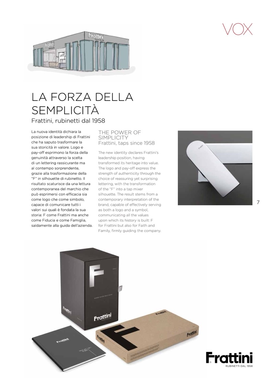
LA FORZA DELLA
SEMPLICITÀ
Frattini, rubinetti dal 1958
La nuova identit
à dichiara la
posizione di leadership di Frattini
che ha saputo trasformare la
sua storicit
à in valore. Logo e
pay-o
ff esprimono la forza della
genuinit
à attraverso la scelta
di un lettering rassicurante ma
al contempo sorprendente,
grazie alla trasformazione della
“F” in silhouette di rubinetto. Il
risultato scaturisce da una lettura
contemporanea del marchio che
pu
ò esprimersi con efficacia sia
come logo che come simbolo,
capace di comunicare tutti i
valori sui quali
è fondata la sua
storia: F come Frattini ma anche
come Fiducia e come Famiglia,
saldamente alla guida dell’azienda.
THE POWER OF
SIMPLICITY
Frattini, taps since 1958
The new identity declares Frattini’s
leadership position, having
transformed its heritage into value.
The logo and pay-o
ff express the
strength of authenticity through the
choice of reassuring yet surprising
lettering, with the transformation
of the “F” into a tap mixer
silhouette. The result stems from a
contemporary interpretation of the
brand, capable of effectively serving
as both a logo and a symbol,
communicating all the values
upon which its history is built: F
for Frattini but also for Faith and
Family, firmly guiding the company.
7

